Turn Claude into a design system that renders your carousels as real 1080x1350 images, in your brand, every time.
Most people use AI for carousels by asking for one, getting something generic, and redesigning it in Canva anyway. This is different. You set Claude up once with a written spec of your brand, and after that every carousel comes out on-brand without you describing the look again.
The key move is that Claude writes real HTML and screenshots it with a headless browser. So the output is not a mockup or a description. It is a folder of post-ready PNGs at exactly the size Instagram wants.
What you end up with
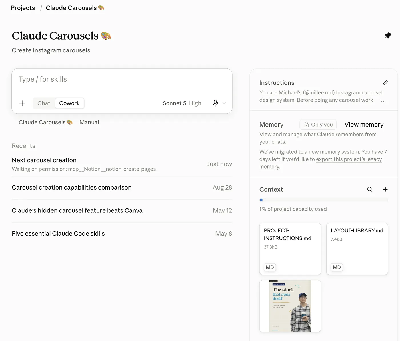
A Claude Project that knows your palette, your fonts, your slide grammar, and your export settings.
A spec document you own and can edit, written in your language about your brand.
A repeatable loop: you say the topic, Claude builds the slides, renders them, looks at the images, fixes what is visibly wrong, and hands you the files.
Actual PNGs at 1080x1350, plus a draggable HTML preview so you can swipe through the set before you post.
Before you start
You need three things:
- Claude with Projects. Any paid plan. Projects are what let the instructions persist across chats.
- A connected folder, if you are on desktop. This is where your photos, logos and finished exports live. Without it you can still work, you will just upload and download files by hand.
- About 30 minutes for setup. After that a full carousel takes one conversation.
You do not need to know how to code. You will not write any HTML yourself.
1. Make the project and the folder
What it does: gives Claude one place to keep your brand spec and one place to find your assets.
Create a new Claude Project. Name it whatever you want. In the description field write one line about what it is for, like “Instagram carousels for my AI content account.”
Then make a folder on your computer with this shape:
Carousels/
  assets/
    photos/          your own photos, screenshots of you, b-roll stills
    screenshots/     app UI, analytics, anything you are pointing at
    logos/           brand marks you will feature
    characters/      a mascot or cutout PNG, if you have one
    stickers/        small doodles or cutouts
  reference-examples/   carousels you admire, saved as images
  exports/              where finished PNGs land
Connect that folder to the Project. The reference-examples folder matters more than it looks. When Claude can see three carousels you already like, the interview in the next step gets much sharper.
2. Run the brand interview
What it does: this is the whole trick. Instead of you trying to describe your aesthetic in a paragraph, Claude interviews you, then writes the spec document itself.
Start a new chat in the Project and paste this in:
I want you to help me build a repeatable Instagram carousel design
system in this project. Before we design anything, interview me about
my brand.

Ask me one question at a time and wait for my answer. Do not batch
them. After each answer, ask a sharper follow up if my answer was
vague.

Cover these, in this order:

1. My niche, my audience, and what I want someone to feel in the first
   half second of seeing a slide.
2. Ground colour. Show me 4 options as named directions with the hex
   for each: warm paper, clean white, soft tint, deep dark. Tell me
   what each one signals and which ones photograph well in a profile
   grid.
3. Accent colour. I want exactly one accent plus one ink colour. Ask
   me for a colour I already use, or offer 4 accents that work on the
   ground I picked, with hexes. Warn me if anything I pick is too
   light to read as type.
4. Display font. Describe 5 directions by feel, not by name, then give
   me 2 real Google Font options for each. Tell me which ones survive
   being shrunk to a 146px profile grid tile and which go wispy.
5. Body font, annotation font, and whether I want a monospace layer
   for small labels.
6. Personality: do I want hand drawn marks, arrows and highlighter, or
   is my brand strictly clean and geometric.
7. My handle, my usual call to action, and whether I use a comment
   keyword.
8. What assets I have: photos of me, a mascot, screenshots, product
   shots.

After the interview, render 3 sample cover slides using my answers, at
420x525, so I can see the direction before we commit. Let me correct
them.

Once I approve a direction, write the full spec as a project document
called PROJECT-INSTRUCTIONS.md. It must be specific enough that a
future chat with zero memory of this conversation can build a carousel
that matches. Include: the palette as a hex table with a role for each
colour, the type scale in pixels, the slide grammar for cover, section
and CTA slides, the export pipeline, and my hard rules.
Answer honestly rather than aspirationally. “I like clean minimal stuff” produces a generic system. “I want it to look like a designer’s sketchbook, warm paper, handwriting in the margins” produces one that is yours.
Two things worth holding onto:
Hold the line at two colours. One ink, one accent, on one ground. Every carousel that looks amateur is using five. Brand logos are the only exception.
Check your display font at grid size. Ask Claude to render your headline at 146px wide, which is how big your post is on your profile grid. Thin serifs disappear there. A heavier face with short ascenders survives.
3. Point the project instructions at the spec
What it does: keeps your Project instructions box short while the real spec lives in a document Claude can read and update.
This matters more than it sounds. The instructions box gets sent to Claude on every single message, so a long one burns context on every turn. Worse, Claude cannot edit it, so the box slowly goes stale while the real system moves on. A document can be rewritten by Claude the moment you agree on a new rule.
So keep the box as a pointer. Paste this into your Project instructions, adjusting the handle:
You are my Instagram carousel design system.

Before doing any carousel work, a new carousel, an edit to an existing
one, or a question about the system, read the project document
PROJECT-INSTRUCTIONS.md in full. It is the complete and current spec:
palette, type, slide grammar, export pipeline, and asset rules. Read
it before writing any code.

LAYOUT-LIBRARY.md holds the slide archetypes. Read it when choosing
composition for a new set.

The brand is fixed. Do not ask me about colours, fonts, handle, or
tone. Ask only about the topic, the slide count if it is not obvious,
and whether there are images to embed.

When a session produces a new rule worth keeping, write it back into
PROJECT-INSTRUCTIONS.md.
That last line is what makes the system compound. Every time you correct something, the correction becomes permanent instead of being re-litigated next month.
4. Build a layout library
What it does: stops every carousel looking identical while keeping them all recognisably yours.
Ask Claude for this in the same Project:
Write a second project document called LAYOUT-LIBRARY.md. It should
describe 8 to 12 slide compositions as named archetypes. For each one:
what the composition is, when to use it, and what assets it needs.

These are compositions only. Palette, fonts and chrome never change
between them, those stay in PROJECT-INSTRUCTIONS.md.

Cover 3 cover types, 6 or more section types, and at least 1 closer.
Include at least one built around a large screenshot with annotations,
one before and after comparison, and one for a ranked list.
After that you can just say “use the comparison layout for slide 4” instead of describing the composition every time.
5. Lock the export pipeline
What it does: turns HTML into post-ready PNGs at the exact size Instagram wants.
Make sure your spec document contains these five facts. They are the difference between a system that works and one that quietly produces broken files. Paste this into your Project and let Claude fold it into the spec:
Add an export section to PROJECT-INSTRUCTIONS.md with these rules:

1. Design at a small viewport and scale up. Build the slide at 420 by
   525 and screenshot with device_scale_factor = 1080/420, which is
   2.5714, to get 1080x1350. Never set the viewport to 1080 wide. That
   reflows the layout and every measurement in the spec becomes wrong.

2. Embed the fonts as base64 woff2 directly in the HTML. Install them
   from npm with @fontsource rather than linking Google Fonts, because
   the render environment cannot reach Google. If you skip this the
   export silently falls back to system fonts and you will not notice
   until the PNG looks wrong.

3. Base64 embed every image too. Check the real file format with the
   file command first, since .png extensions often hide JPEGs.

4. Generate the HTML by writing it to a file from Python, never with a
   shell heredoc. Interpolation inside a heredoc mangles CSS braces.

5. Before screenshotting, run an overflow check: measure every element
   in the content area against the safe bottom and right edges and
   print anything that crosses them. Catching an overflow in numbers
   is faster than spotting it in a picture.

Also write down my safe content padding and the exact viewport
constants so a future chat does not have to rediscover them.
The first rule is the one people get wrong. It feels obvious to render at the final size. But a 1080px viewport makes the browser lay everything out as though it were a desktop page, so your line breaks, your padding, and your font sizes all land somewhere else. Design small, scale at capture time.
6. The working loop
What it does: gets you from idea to posted carousel without a long back and forth.
Once the system exists, a carousel looks like this:
You say the topic and the shape. “Seven slides on the three mistakes people make writing hooks. Slide 5 should use a screenshot, I will upload it.”
Claude builds and renders. It writes the HTML, exports the PNGs, and looks at the images itself before showing you anything. This step is not optional and it belongs in your spec. Claude catches its own overlapping text and clipped descenders far faster than you catch them in a preview.
You give surgical notes. “Slide 3, the headline should break after got. Slide 6, make the screenshot bigger and drop the annotation.” One slide at a time. A good system never rebuilds the whole set for a single slide fix.
You get the files. The PNGs land in your exports folder. Ask for a draggable HTML preview too, so you can swipe through the set the way a viewer will.
Two copy rules worth putting in your spec on day one:
No orphan lines. If a sentence starts on its own line and leaves a half empty line above it, the slide looks unfinished. Lines should be filled unless the break is deliberate.
Bigger type, fewer words. Every carousel gets worse when you add a sentence and better when you cut one. The visual carries the narrative.
Troubleshooting
- The fonts came out wrong. The export environment reached for Google Fonts and failed silently. Fonts must be base64 embedded in the HTML.
- Text is running off the slide. Your content padding is not being respected, or the overflow check is not in the pipeline. Ask Claude to print the measurements rather than eyeball the image.
- Every carousel looks the same. You only have one archetype in practice. Ask Claude to vary the composition per slide, using the layout library, while keeping palette and chrome fixed.
- Claude forgot the brand this chat. The Project instructions are pointing at a document Claude did not read. Say “read the spec document in full before you start” and check that the pointer text is actually in the instructions box.
- A hand drawn arrow points at nothing. An arrow is only allowed when it connects a label to a specific thing on the slide. Floating strokes are decoration. Cut them.